For March 7, Read pages 137-147 IN DETAIL!!! in your text book (Photography, by Barbara London, 10th Edition)
Begin Shooting the 4 rolls of film for the "Film Test" Due March 14th
Friday, February 25, 2011
Slide Film vs. Negative Film vs. Digital

Pictured above: Basic Color Film Structure
How is color recorded differently on Film vs. Digital\?
Negative vs. Transparency:
Negatives show reverse (complimentary) tones of the original subject and have an overall reddish-orange cast. This orange cast helps to control color balance and contrast in printing.


Transparency (Chrome) Film is used more professionally. It shows a positive image of the subject and can be easily viewed on a light table. The film itself is more expensive, however you don't need to make a contact sheet.

There is generally more flexibility in push and pull processing when shooting a negative that when shooting a slide.
Push Film Processing: (brightens the film) over-development of the film, compensating for under-exposure in the camera.
Pull Film Processing: (darkens the film) a technique that compensates for overexposed film by under- developing it at the processing stage

This difference could be compared in digital photography to shooting a JPG (chrome) vs. RAW (negative). Negatives (like raw images) have more exposure latitude and better correctability when printed. Chromes or Jpgs aren't so forgiving or flexible.
Professional vs. Amateur Films:
Professional films are manufactured according to specific color specifications so that one can control color. An amateur version of a certain film may have more saturation or higher contrast for added impact, whereas a the pro version of that film may have less intensity and contrast to allow for more accurate skin tones or greater detail. This difference could be compared in digital photography to shooting a JPG (amateur) vs. RAW (pro). A JPG has automatic settings applied whereas in a RAW file, the photographer is able to manipulate the color and contrast greatly.
JPG vs. RAW:
If exposure is reduced on an overexposed raw image (instead of a JPG), much more detail can be salvaged.

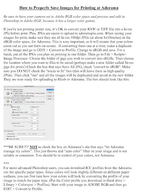
Emulsion Batches vs. Color ICC Printing Profiles:
ICC profles are explained HERE.
For a list of Adorama's Downloadable ICC profiles to match their paper types, click here.
When using film, emulsion batches are used in processing to help get the colors exactly how you want them. Each batch is subject to minor variations in color balance, contrast, etc. Each batch has its own number printed on the film. When shooting film, buy several of the same batch, shoot a test roll & process it. Add filters as necessary to get the colors exactly how you want them. Be sure to print always at the same lab to get the results you want.
Similarly, in digital photography, you can use specific printing profiles. Assigning a specific profile to a TIFF can change the colors in the print. The paper also plays a roll in the way the colors will look. Always working from the same monitor and with the same lab, make a series of prints with different ICC profiles until you get a print with color that matches your monitor exactly.
Daylight Film vs. Tungsten Film:
Similar to the settings in our digital cameras, film is based on Kelvins. Most color films are daylight balanced (5500K) which is average color temperature in direct sun at noon. If you are shooting with this film on a foggy day you may want to use a filter to get the colors correct. Color daylight film will also work indoors when using electronic flash because the output of the flash is about the same temperature as sun (about 5500K). Tungsten film is set to 3200K and is made for indoor lighting (and no flash). If shooting indoors with florescent lighting, it may be necessary to use a corrective gel or filter on your lens to get the color temperature right, as different bulbs have different color temperatures. (Other types of tungsten film are available to buy as well but are not as common). Negatives can be filtered when printed to correct color but with transparency film it is not as easy.
Film Characteristics: Different color films record color differently. Some make colors more vibrant, others make the same colors more muted. The same red balloon shot with one type of color film may look like a different shade of red when shot with another type of film. In digital photography, these colors can be quite easily manipulated and corrected using Photoshop.
Correction Filters (used to correct color temp when shooting film)
Filters can be used on the lens or light source when shooting FILM to adjust the color temperature and make to colors come out correct. Remember that you also need to adjust your exposure to compensate for filters used. Here is a chart of filters and when to use them:
CC filters and 80 series filters that are commonly used.

To more precisely figure out filter factors, first read this chart.
Then use this filter factor converter:
http://www.fineart-photography.com/ff_fs.html
Conversion Table for Corrective Filters
In class Feb. 14, we did a walking/shooting field trip to the Highline. Shooting outdoors in daylight, students set their digital cameras to Tungsten White Balance and then used corrective gel filters to achieve accurate colors. (This was done to immediately demonstrate the effect these filters would have if one was shooting tungsten film outdoors- a film assignment is coming up next).
Here is a chart that explains filter usage in detail. This will be especially useful when shooting film. For example, if you have a roll of Tungsten Film and want to shoot half of it indoors and half of it outdoors, using a color temperature meter, gel filters and this chart, you would be able to achieve accurate white balance in all lighting situations:
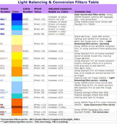
click chart to enlarge
History of Color Photography Presentation: Feb. 28th
In class on Feb 14th, each student was given a small piece of paper with a different topic to present on Feb 28th. Each topic had something to do with the history of Photography (leading up to the invention of color photography). Each student should prepare a brief 5 minute presentation/discussion on their topic. Please bring in images (on a flash drive or printed) that help demonstrate your topic if necessary. You do not need to prepare a Powerpoint or anything formal- this will be more of a conversation.
Monday, February 14, 2011
Asst 3: Times of Day Assignment Due Feb. 28th
HW Due Feb 28/ Day-long Photo Narrative
Looking at Natural Light and color temperature: How does color temperature change throughout the day?
Using your Digital Camera set to the daylight setting in white balance, take a series of photos from sunrise to dark (at least 2 hours after sunset). Take photos outside, using natural light only (no flash), at least every 2 hours if possible. ISO 100 or 200 to avoid grain. You may need a tripod for early morning and evening.
Tell a story with your photos- the story of one day, but any story you want. Make it interesting!! These images can be a mixture of portraits, cityscapes, still life- whatever you think tells a compelling story. Just be sure to shoot outdoors. You can include some indoor shots if they show a window with daylight coming through. When is the light warmer? What time of day is the light cooler? What role do these tones play in the meaning of your image?
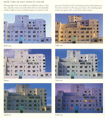
Choose 10 images that tell the story best. Bring the 10 images to class PRINTED 4x6 from Adorama. Be sure to follow the handout below for proper uploading and color management. You have 2 weeks for this assignment- remember that Adorama sometimes take 1 week to process photos, so plan ahead.

Sunday, February 13, 2011
The Color Wheel

Complimentary colors appear directly opposite one another on a color wheel—for example, green and magenta, as shown above. Each pair of complementary colors comprises a warm color and a cool color.
Click HERE for an online exercise in complimentary colors.
So WHY do we see ghostly effects of the complementaty colors? An explanation is HERE.
What effect do different colors have on us?
Check out this blog for some interesting articles on how color affects us.
Measuring Color in Kelvins
Color Temperature is measured in Kelvins.

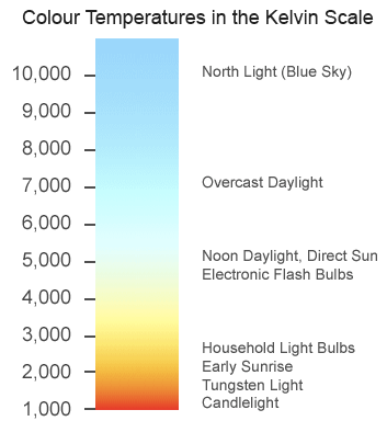
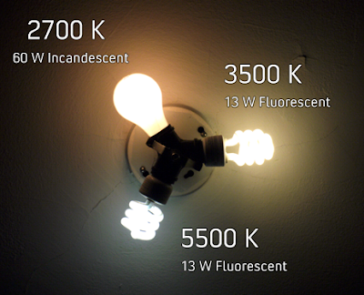
Color temperature is closely related to white balance. If it is slightly off, it can make the picture look cooler (more blue) or warmer (more orange/red) than it is in actuality. Color temperature is especially important when accurate color recording is necessary. Alternatively, color temperature can be purposely thrown off to change the meaning of the photo.
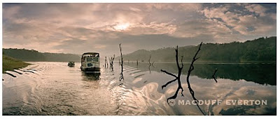
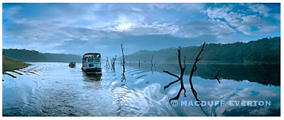
Take for example the work of the well known landscape photographer, Macduff Everton.
Here is his image called: "Dawn, Lake Periyar, Kerala, India"
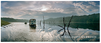
Imagine how different this image could be perceived had it been taken with a slightly different color temperature or white balance? Completely changes the meaning and feeling of the image.


Color temperature is closely related to white balance. If it is slightly off, it can make the picture look cooler (more blue) or warmer (more orange/red) than it is in actuality. Color temperature is especially important when accurate color recording is necessary. Alternatively, color temperature can be purposely thrown off to change the meaning of the photo.
Take for example the work of the well known landscape photographer, Macduff Everton.
Here is his image called: "Dawn, Lake Periyar, Kerala, India"

Imagine how different this image could be perceived had it been taken with a slightly different color temperature or white balance? Completely changes the meaning and feeling of the image.


Monday, February 7, 2011
Asst 2: GELS: Due Feb 14th
*Each student should turn in one raw digital file of the Additive color demo they shot in class (R+G+B).
For HW, using gels, shoot a series of images:
One night landscape, one portrait and one still life.
Use at least 2 colors of your choice. Gels can be used on lenses, hot lights or on flashes. Turn in your 3 images as RAW files.
(You can shoot all of them at night, but you don't have to.)
Gels are available at:
Calumet
Adorama
B&H
Additive Color Demo
In class on Feb. 7, after a lecture on additive and subtractive color, we'll do an exercise together that illustrates the idea of additive RGB colors. By using the multiple exposure function on the Nikon D300, we took (3) 4 second frames at F22, ISO 200. Those 3 frames are then combined into one raw file in the D300 when on multiple exposure mode. During each exposure, someone popped a SB600 flash gelled with a different color. The flash was hand held off camera, set to manual mode and full output 1/1. During the first exposure, a red gelled flash was popped, then we moved the subject over slightly and popped a green gelled flash, then moved it over yet again and popped a blue gelled flash. The gels we used were from the free rosco sample packs, taped to the flash.
The resulting image, below, shows that yellow is made when red and green overlap, cyan is made when green and blue overlap and when red and blue overlap, magenta is created.
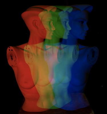
This image, shot by current students in class Feb 7, shows clearly how yellow is created when red and green are mixed.
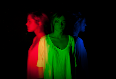
The resulting image, below, shows that yellow is made when red and green overlap, cyan is made when green and blue overlap and when red and blue overlap, magenta is created.

This image, shot by current students in class Feb 7, shows clearly how yellow is created when red and green are mixed.

RGB vs. CMYK

Additive (RGB): (Monitors, TV screens) White Light is produced by mixing colors.
RGB (red, green, blue): Emitted Light. Your computer screen uses RGB.
The RGB color model is an additive color model in which red, green, and blue light are added together in various ways to reproduce a broad array of colors. The name of the model comes from the initials of the three additive primary colors, red, green, and blue. The main purpose of the RGB color model is for the sensing, representation, and display of images in electronic systems, such as televisions and computers, though it has also been used in conventional photography.

Subtractive (CMYK): (Printing) Black is produced by mixing colors.
CMYK (cyan, magenta, yellow, black): Reflective light, Used for printed media.
The CMYK color model, referred to as process color or four color, is a subtractive color model, used in color printing, also used to describe the printing process itself. CMYK refers to the four inks used in most color printing: cyan, magenta, yellow, and key black.The CMYK model works by partially or entirely masking certain colors on the typically white background (that is, absorbing particular wavelengths of light). Such a model is called subtractive because inks “subtract” brightness from white.
Imagine you have 3 projectors on at the same time. One is projecting a beam of green light, one projects and beam of red light and one projects a beam of blue. When they cross and overlap, all 3 beams together become white. Just red and green make yellow. Just blue and green make cyan. Just Red and Blue make Magenta.
Color Physics: What happens when you mix RGB? (Red, Green and Blue light)
Additive vs. Subtractive Color | RGB and CMYK


Using the eye dropper tool in Photoshop, look at the Numeric RGB color values of the colors on this chart:

Class Goal: Thinking Ahead
The ultimate goal of this class will be to present a portfolio of images shot in color and printed 11x14" or larger. Start thinking now about what you might like to focus on and shoot within that idea for the class assignments if you can.
Here are some samples of final student portfolios from last year's class:
http://fitcolor.blogspot.com/2010/05/final-projects.html
You can shoot ANYTHING!!! Just make sure your final series is within one idea, subject, place, etc. We are aiming towards a series of approx 15 images that are beautifully printed and cohesive in overall theme.
Tuesday, February 1, 2011
Assignment 1, Due Feb 8. Emotion + Found Color
This assignment will be started in class and you will need to finish it for HW. You can shoot indoors or out. Subject matter is your choice. Click to enlarge:


Subscribe to:
Posts (Atom)