Saturday, May 21, 2011

Final Projects!

Nice work, Color Class! Overall, the class produced some really impressive final work in color. 
Disney World by Alison Garber


Disney World by Alison Garber

Disney World by Alison Garber

Alana Haynes projected her drawings on models

Alana Haynes projected her drawings on models

Alana Haynes projected her drawings on models

Dylan Wey took pictures at a Street Fair for the Tribeca Film Festival

Dylan Wey took pictures at a Street Fair for the Tribeca Film Festival

Jessica Farkas projected animal prints on models

Jessica Farkas projected animal prints on models

Monday, May 16, 2011

Color Print Test results

Overwhelmingly, after trying several print labs and paper types around the city, the printer of choice was FIT's own PrintFX/Graphics Lab drop- off inkjets.  (Their 8x10" inkjets for $5 rivaled Print Space's $17 inkjets!) Print Space's $12 Dig Cs were good though, and better than some of Adorama's prints. Adorama's prints done using Adorama's ICC profiles ($2 for 8x10" prints) had generally consistent good color (with some exceptions) and were a good deal for the price.

We are saddened by the mass amount of people who will never see the full potential of their color images because of printing at places like CVS!

Monday, May 9, 2011

Final Critique Thursday May 19th, 12 noon

Our class May 23rd is canceled. We will instead be meeting for the final critique on Thursday May 19th at noon in D420 (not our normal classroom).

What's Due:
6 beautiful color prints, one cohesive theme!
inkjet or digital c
8x10 or larger

Thurs May 19th will be the color last class meeting of the semester.

Cross Processing Assignments

James (models) and Flaviu (city scapes) made some particularly interesting images with the cross processing assignment:


Flaviu's work looks very flat overall, whether up close or far away and bring to mind the textural work by Aaron Siskind.

Thursday, April 28, 2011

Print Test Due May 9

The Great Digital Color Printing Test!
Due May 9

The point of this exercise is to evaluate the print quality at different labs around the city so that you’ll know which lab you prefer in the future when you make prints. It’s also important to recognize how color can change in an image depending on what color profile is used, what paper it’s printed on and where it’s printed.

All prints should be 8x10”. Each group should print the same image (group’s choice), from the same file: hi-res JPG or flat TIFF. All retouching and output sharpening must be done before the file is distributed to the group members. Since some prints cost more than others, I suggest each group split the total cost of the 4 prints. (should come to about $5 per person). To assign a profile before print, go to EDIT > Convert to Profile > Save.

Each group needs to present a written and oral summary of the results of their group’s print test. Please also submit the digital file you print from.

Group 1: Ray, James, Dylan, Flaviu
* remember to Uncheck box that lets adorama color correct. Adorama prints are $2 each.
Put downloaded ICC profiles in LIBRARY > COLOR SYNC > PROFILES
Print 1: Glossy Paper Adorama (must use ICC profile for glossy)
Print 2: Glossy Paper Inkjet at Graphics Lab, leave in Adobe RGB color space
Print 3: a color laser print at Graphics Lab (convert to sRGB)
Print 4: DIY inkjet print at Graphics lab (image should be in adobe RGB color space)

Group 2: Joey, Rebecca, Jenny, Ali
* remember to Uncheck box that lets adorama color correct. Adorama prints are $2 each.
Put downloaded ICC profiles in LIBRARY > COLOR SYNC > PROFILES
Print 1: glossy Adorama  (use adorama’s glossy icc profile)
Print 2: luster Adorama (use adorama’s luster icc profile)
Print 3: matte Adorama (use adorama’s matte icc profile)
Print 4: mettalic Adorama (use adorama’s mettalic icc profile)
Print 5: print space digital C, your choice of paper (image should be Adobe RGB color space) $11.50

Group 3: Victoria, Nicholas, Jessica Kirkham, Foli
Print 1: CVS (convert to sRGB)
Print 2: Staples – (convert to sRGB)
Print 3: Glossy Paper Ink Jet at Graphics Lab (leave in Adobe RGB)
Print 4: Sunshine, on Glossy paper. (ask Sunshine what profile they require, I think sRGB?)

Group 4: (all prints are matte) Danielle, Primo, Karina, Jessica Farkas
Put downloaded ICC profiles in LIBRARY > COLOR SYNC > PROFILES
Print 1: Adorama: put image in sRGB color profile. Make print on matte paper- * remember to Uncheck box that lets adorama color correct.
Print 2:Adorama: print on matte paper, use icc profile for matte paper- * remember to Uncheck box that lets adorama color correct.
Print 3: Adorama: leave in Adobe RGB color profile. "let Adorama color correct!" Print on matte paper.
Print 4: Adorama on matte paper. Leave image in adobe RGB 1998 profile - * remember to Uncheck box that lets adorama color correct.
Print 5: Print Space Digital C Print Matte Paper (leave in Adobe RGB) $11.50

Group 5: Clementine, Hannah, Alana, William
Print 1: Print space Inkjet Glossy (image should be Adobe RGB color space) $16
Email pre-prepped adobe RGB 8x10” flat file to psdigital@gmail.com, 24 hr turnaround.
Print 2: FIT Graphics lab drop off inkjet glossy, $5 (image should be Adobe RGB color space)
Print 3: Home  Printer Inkjet (leave in Adobe RGB)

Digital Color Printing in NYC

Some Suggestions...

Adorama: http://www.adoramapix.com
Cheaper Digital C prints. Upload online, approx 1 week turn around.
8x10s are about $2 each
11x14" $4

Print Space:  http://printspacenyc.com/digital/

Email pre-prepped adobe RGB 8x10” flat file to psdigital@gmail.com, 24 hr turnaround.

Inkjet 8x10 = $16
Digital C= $11.50

Duggal: http://www.duggal.com/submit-project-online.aspx
Submit online, 2 day turnaround, one of the "high end" printing labs in NYC...more expensive than other labs.
Dig C Print- 8x10", $2
Inkjet- 20x30" minimum page size, $75
Giclee Fine Art Print- 8x10", $52

FIT Graphics Lab:  http://www.fitnyc.edu/8591.asp
Inkjet Sheet Prints
Premium portfolio quality inkjet printing using high quality Epson brand sheet paper. Matte, semigloss, glossy, watercolor (13x19 only). We print using a high resolution and ICC profiles for color accuracy.
8.5"x11"-- $5.00
13"x19" -- $7.00
17"x22" -- $10.00
Pay by using money added to your FIT I.D.

Wednesday, April 27, 2011

Cross Processing Assignment Due May 2

Cross processing =  developing one type of film in the chemicals for a different type of film. 

Types of cross processing

  • E6 > C41: slide film processed in color negative chemicals. This is the most common type of cross processing. Results:  increased contrast with strong colour casts.
  • C41 > E6: color negative film developed in slide chemicals. Results: muted pastel colors with very little contrast. For increased contrast, ask your lab to push 2 or 3 stops.
  • Digital Cross Processing can be done in Photoshop, often using Curves  or Presets in Adobe Camera Raw
Cross processing is experimental. You may choose any film you want, however, here is what generally happens with these types of chrome films when cross processed:

Fuji Provia 100 – results are relatively Green
Fuji Provia 400 – results are relatively Green
Fuji Velvia 50 – results are usually Greenish/Blue
Fuji Velvia 100 – results are relatively Reddish
Kodak Ektachrome 100 – Not much color shift, but there will be increased contrast & saturation
    If you opt to do this assignment digitally, a cross processing effect can be done in Photoshop. It can be done several different ways. Here are some ideas:

    Using Curves (click here for an article how-to)
    Using Curves (click here for a video demo)
    By Downloading Presets for Camera Raw: Click here to download some
    Unzip the file of presets and put the folder in Applications > Photoshop > Presets. To install these presets open up Camera Raw, click on the presets tab and then select "load settings". Then find the files you just put in the Presets folder. Once applied, save each preset in Photoshop on the presets tab after you apply it so that you can use it again in the future.

    Click here to download even more presets

    Or...you can make your own presets in Adobe Camera Raw!


    images above by Stowell Photography


     Assignment due May 2:
    Shoot one roll of film (24 frames) and have it cross processed. Turn in Film in class. If you are turning in slides, you don't need to make a contact sheet. If you shoot negatives, please turn in scans of your top 10 or a contact sheet.
    OR you may opt to do this assignment digitally and submit 10 JPGs that have been cross processed in Photoshop.

    Make the images interesting!! Choose colorful subjects! 

    Sunday, April 24, 2011

    Review: How to Apply ICC Profiles at Adorama

    Adorama has a series of ICC profiles you can download for the different papers they offer. This makes colors MUCH more accurate.

    Here's how to do it:

    Download the profiles here http://www.adoramapix.com/Support.aspx?SupportID=prepcolor
    Once you download, the ICC profile looks like this:

    If you're on your home computer (MAC), click on the hard drive and find the folder that says "Library". Open that, look for the "Color Sync" folder, Then look for the folder called "Profiles". Drop the ICC Profiles you've downloaded in that profiles folder. (If you're on a school computer where you don't have admin proveldges, drop the files into /Users//Library/ColorSync/Profiles — any profiles stored here are available only to the current user.) For PC user instructions, click the link above.

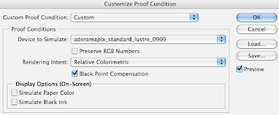
    Then in Photoshop, you can launch the profiles by going to view > proof setup > custom, and choose the Adorama profiles. Leave the box as is (with the default settings) The box should look like this:


    Once you do the proof setup then go to Edit > convert to profile. Choose the Adorama profile for whatever paper you're printing with and save the file.

    At Adorama, if you've used a profile and made your own color corrections, you should NOT check the box to have Adorama correct the colors.

    Mismatched Color Profile Notification

    Question:

    Every time I open a file I get a prompt which reads: Embedded Profile Mismatch.

    Embedded: Camera RGB Profile

    Working: Adobe RGB (1998)

    Should I choose the default, which is the "embedded profile (instead of working space)?


    The answer is here:
    http://forums.adobe.com/thread/370738?decorator=print&displayFullThread=true

    Shooting with a Gray Card for Accurate Color

    Its a good idea to take your first shot in a series of images with either a gray card or a Macbeth Color Checker Chart.  This way, if when you process the images you find that your Auto White Balance wasn't up to snuff and every image has a weird color cast, then you can easily correct it.

    Neutral (50% gray) = 128/128/128


    There's a basic online tutorial here. 
    But basically, use the White Balance Eye Dropper in Camera Raw and pluck the gray card, or in Levels the center eyedropper will make any area it is clicked on neutral gray, (that is to say equal values of R, G and B). So if the color balance of a photo containing a gray card is off it can be corrected automatically by opening it in levels and clicking on the card image with the center eyedropper.

    Munsell Color is a division of Macbeth. In colorimetry, the Munsell color system is a color space that specifies colors based on three color dimensions: hue, value (lightness), and chroma (color purity). It was created by Professor Albert H. Munsell in the first decade of the 20th century and adopted by the USDA as the official color system for soil research in the 1930s. Munsell Color is the international scientific reference for the colors of artifacts.

    Friday, April 22, 2011

    Achromatic Still Life- Image Samples

    Here are some image samples from past FIT students' achromatic still life shoot:

    Nicole DelMonico:

    Liz Gurney:


    Jessica Lemos:


    Craig Abare:


    Paul Kingston:


    An ACHROMATIC color is a color lacking hue, for example BLACK, WHITE or GRAY. For HW, all students are to shoot an achromatic still life, inspired by the images above. They will then be printed 8x10" at the lab of your choice.  The images will be shot in color, however they'll be relatively hue-less, therefore a color temperature shift will more visibly evident. The goal is to have shades of gray with no tint in the printing- printed images should match monitor.

    Saturday, April 16, 2011

    Friday, April 8, 2011

    Achromatic Still Life Due April 25th

    Please shoot a series of achromatic objects as a still life shoot. You may shoot film or digitally. One print (8x10") will be due after Spring Break on April 25th.


    Is the above image a black & white photograph or a color photograph?

    Black = a combination of all colors in pigment form (subtractive)
    White = a combination of all colors as light (additive)

    Q: Scientifically speaking, is black a color? Is white a color?

    A: Yes- There is no question that black and white are colors. The technical definition of color that is internationally agreed upon includes them as colors. This definition defines achromatic colors as follows: "A color lacking hue, such as white, grey or black". Basically, Black, White and Gray are colors that lack HUE.

    Definitions of Color according to the ISCC (Inter Society Color Council) www.iscc.org

    Munsell color system
    The idea that there are three color dimensions: hue, value (lightness), and chroma (color purity or colorfulness)

    COLOR TERMS:

    ACHROMATIC: a color lacking hue; white or gray or black

    HUE determines the weakness or intensity of a color.

    LIGHTNESS (sometimes called value or tone) is a property of a color. It is the perceived brightness of a color for the human eye along a lightness–darkness axis. A color's lightness also corresponds to its amplitude, or strength.

    SATURATION is the colorfulness of a color relative to its own brightness.

    IN CLASS SHOOTING EXERCISE:
    Using various "hue-less" objects (black, white, gray and clear objects) create still life images using the case lights and white, black or gray backgrounds. Pay special attention to the white balance. The goal is to make sure you don't have a color cast to the image- no bluish or orangish tones. Shoot a series of digital images in color. If you opt to shoot film, use a color temperature meter or a corrective gel on your lens to get the shades of gray to look just as your eye sees them. Your resulting images should look black and white but actually be in color. FOR HW: Finish last week's assignment and make one 8x10 print of one the  achromatic image you shot in class. Make a print using the printer of your choice.


    A shift in temperature change should be more easy to see when shooting color photographs of achromatic objects. Sometimes it is more difficult to see a slight color shift in skin tone or everyday color scenes.


    In thinking about still life, for ideas of COMPOSITION, please refer to the works of the late Irving Penn for inspiration.

    Click image below for samples of his still life photos.


    Erwin Olaf's work called "Dawn" is a series of color photographs that look almost achromatic. Color photographs below by Erwin Olaf


    Still Life Images by Laura Letinsky: